Better understanding how horses see and what they see clearly has huge ramifications for safer eventing and cross-country course design. The latest British research into equine eyesight is already raising eyebrows.


“This translates to horses
seeing the world in a palette
of blues and yellows.”
We like to think that some horses have exceptional, if not extra-sensory vision, with the capacity to see monsters in the bush or ghosts under fences, but this is far from the truth. Their eyesight is pretty limited compared to humans.
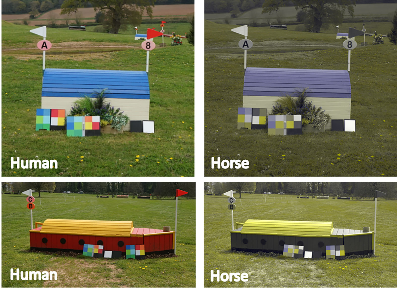
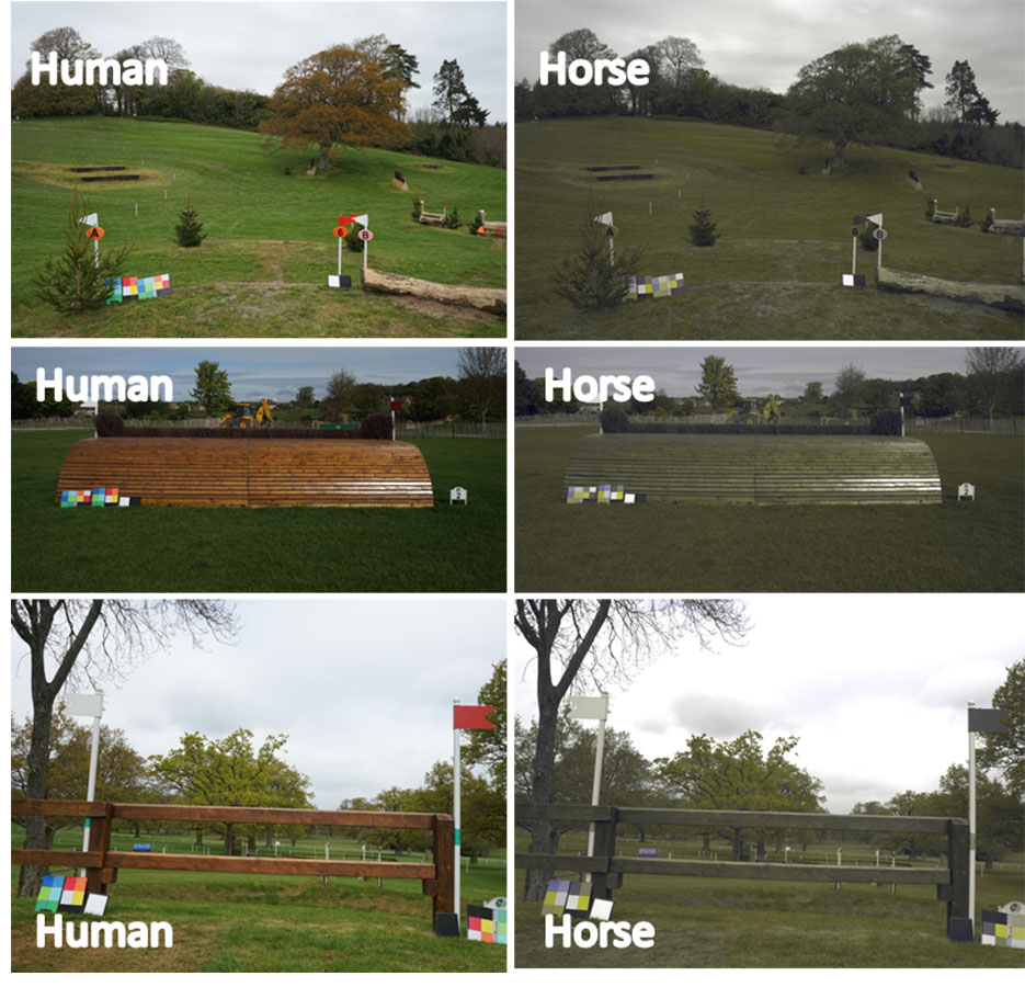
Horses are dichromats, which means they see a reduced number of colours compared to humans, who are trichromats (see diagram). This translates to horses seeing the world in a palette of blues and yellows, and they find it more difficult to detect subtle differences in natural colours. Traditionally, many of the colours and materials used in cross-country fences are rustic colours such as reds, orange, greens and natural wood, which horses likely find difficult to distinguish.
From his base at Exeter University in the UK, where he is part of the Sensory Ecology and Evolution Group, Professor Martin Stevens has focused more than 15 years of research on how animal vision works and how this influences their behaviour. “Most of my work had until recently been focused on the natural world, but I started to become very interested in how knowledge of animal vision could help inform various areas of human life, including animal training, welfare and safety,” explains Professor Stevens, whose eventing research project was partly funded by British Eventing, the governing body for the sport in the UK.
“Horse sports immediately seemed to be an area where such knowledge and methods could have great value to complement what was known already by those in the industry, since much of the obstacles and environment is still based on human perception.”
In the course of his eventing research, Professor Stevens and his team analysed the contrast of important elements of cross-country fences by taking digital images at five affiliated British events, covering 15 courses from 80cm to four-star (now five-star) level. They looked at a number of areas, including the contrast in colours between the foreground and groundline, and the top of the fence and the background. They also looked at variations between colours and foreground materials like sand or grass, and lighting conditions according to the weather at the time.
The researchers found that conspicuousness of the groundline influenced the fault rate at the two highest levels (equivalent to CCN3* level and above), but was not influential at the lower levels between EvA80 and CCN2*. Furthermore, the conspicuousness of the top of the fence influenced the fault rate at the middle two levels (equivalent to CCN2* and CCN3*), but not at the lowest or highest levels. In analysis, the scientists proposed that the fault rate at the lowest levels was more likely linked to the training and education of the less experienced horses, rather than explained by limitations to a horse’s vision and thus his understanding of the fence design.
Professor Stevens and his team suggested that yellow, blue or white matt paint would improve visibility of fence components such as the groundline or top of the fence.
British international course designer, Captain Mark Phillips, supports the idea of clearly contrasting fence edges. “What we give the horse to enable it to read the leading edge of the fence is hugely important,” he says. “The leading edge has got to have enough contrast with the surroundings so that the horse can clearly understand the question.”
Australian international course designer, Wayne Copping, agrees: “I have been advocating the use of contrast for 20 years at least, on the groundline and then at the high point. It seemed obvious to me to tell the horse where the take-off was and where he had to have his legs up to not hit the obstacle.”


Wayne is also keen to point out the importance of this clarity on the back line of spread fences: “I have not been conscious of certain colours, but rather good contrast at the front of the jump and also the back line of a big spread.” A better understanding of equine vision will also aid the understanding of how horses jump into light or shade: “I think it makes us more aware of jumping into dark and then out into light, where horses take two or three strides to adjust to the conditions in these circumstances,” adds Wayne.
Badminton five-star course designer, Eric Winter, says colour has always been a contentious issue. “I think this research is great in that it puts science behind a lot of the skills that are passed down between course designers,” he says. “David Evans (international course designer and builder) always told me that plain logs jump better than rustic, because without bark the wood is a little brighter and easer to see. We also knew that a gloss-painted white pole is harder to see when sunny, and I was always told that it is better to use matt white paint anecdotally, but it’s good to have the science behind it.”
Capt. Phillips concurs: “Now we are getting this sort of scientific evidence to support what we already know from experience. Research is not the total solution, but it is part of helping us to help the horse understand the question.” Wayne has seen some changes in today’s cross-country courses: “I have lately seen a lot the lighter blues, pinks and yellows, which are fine on one jump but not on everything. It still has to look like cross country after all, not showjumping.”
Capt. Phillips has already shared some of the key findings from this study in the USA. “The future of course design is better understanding how the horse understands the question. If you want to stay at the top of your game, you have to keep abreast of current developments.”
Professor Stevens is eager to do more work with British Eventing: “I’m very keen to test what we have found in this study in full behavioural trials, where we can work with trainers and riders to test horse responses to different fences that have been carefully designed to account for horse vision.”
PROF. MARTIN STEVENS
Professor Martin Stevens is Chair in Sensory and Evolutionary Ecology, University of Exeter. He gained his PhD in 2006 and became a professor of sensory ecology in 2017. He is in demand to lecture worldwide, and has published three books and more than 100 journal articles.
Facebook: https://www.facebook.com/SensoryEcology

ABOUT THE AUTHOR
KATE HERREN
Originally from the UK, for eight years Kate held the position of Consulting Editor for British Eventing Life magazine. A graduate of equine science, she enjoys writing about a wide range of equestrian topics with special interests in eventing, welfare and research.
FEI SEES THE LIGHT
The FEI Cross Country Course design guidelines, last updated in 2018, make a number of references to the use of colour in fence design. The guidelines advise officials and course designers to be aware of the importance of contrast in the design of courses, with the contrast between the top of the fence and the background of the utmost importance. At all levels, course designers should recognise the effect of shadow and light to dark.
The most direct reference to the colour of cross-country rails comes in a section advising on the use of different colours for the top rails of an open oxer, where it is suggested that the front rail should be the lighter coloured one. In the section referring to water jump design, the FEI recommends using different shades of colours or clearly differentiated colours so the horse can quickly understand what he has to jump. The FEI already notes the significance of paint finish type and advises course designers to avoid reflective materials, gloss paint and shiny varnishes. EQ